Visualising IRC data
I’ve wanted to post this graph for a while but only just got round to anonymising the data.
Looking at piles of IRC logs can be very unilluminating, but it’s not obvious what to do with all the data. One nice way of getting a handle on links between channels is to plot channels with links between them weighted by the number of users in common.
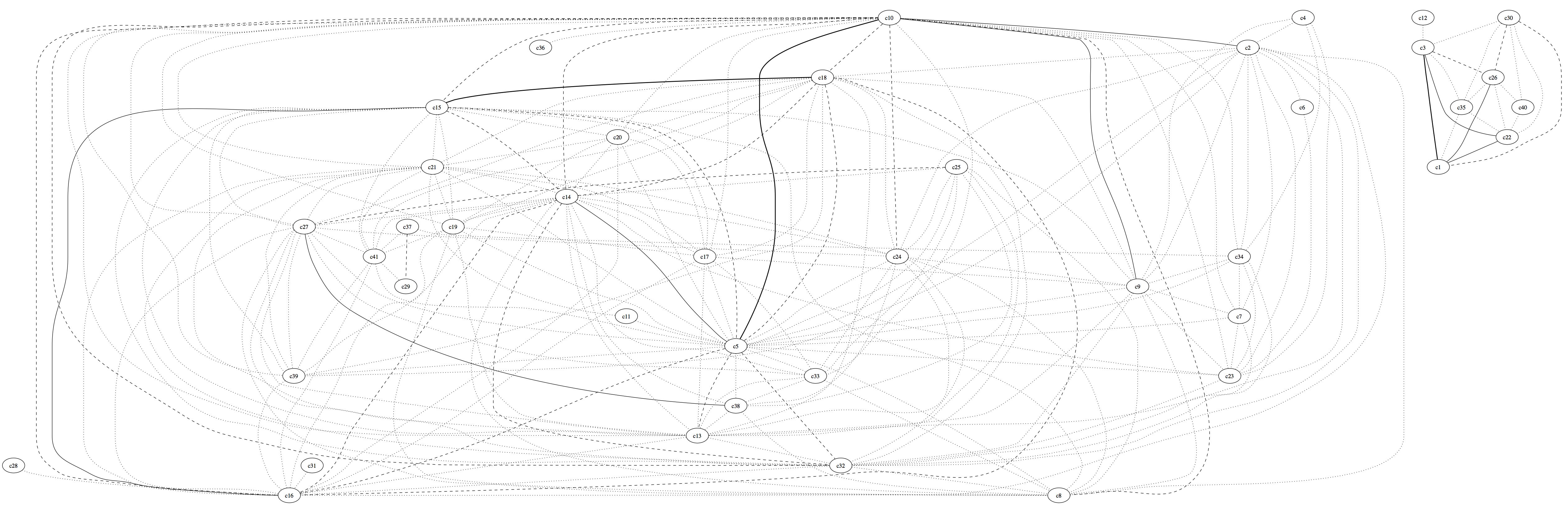
The example above is from a honeynet we ran in 2004/5. The graph shows up a couple of things nicely:
1) There are two distinct groups of channels, and a look at the data shows that there two groups correspond to channels in different languages and,
2) The strong links between a couple of channels in the main group show up that these channels are related and looking at the data shows them to be used for discussing hacking, while the other channels are innocuous.
The original channel names have been replaced by ‘cN’ to protect the guilty.